April 9, 2014
I got an email yesterday from a teacher asking about web tools that her students can use to create mapped data sets and visual representations of data. I went ahead and compiled the list below featuring some of the best web tools for this purpose. Besides enabling you to create data visualizations, these web tools also contain galleries and libraries of already made visualizations that students can use in their projects.
1- Statplanet
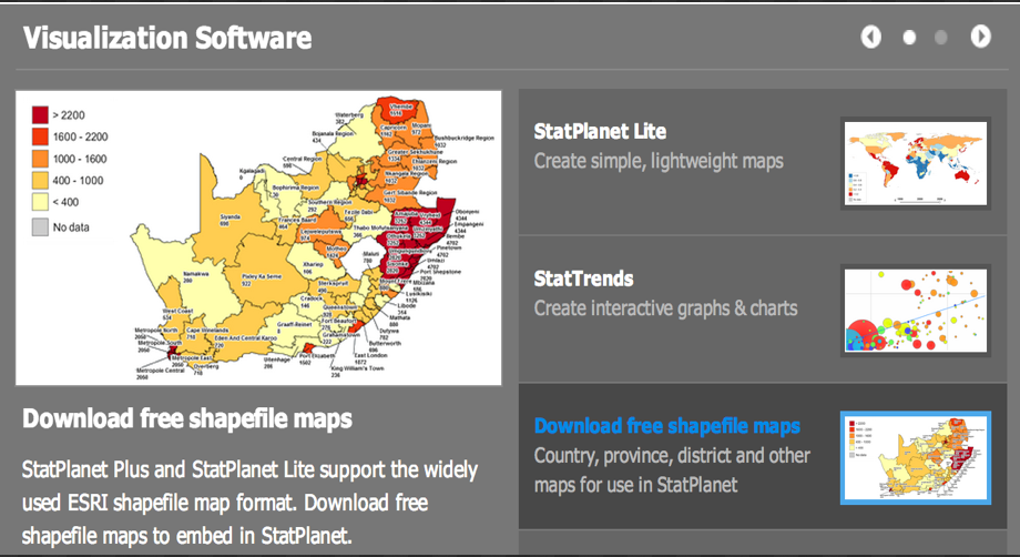
StatPlanet (formerly StatPlanet Map Maker) is a free application for creating interactive maps which are fully customizable. In addition to maps, the software also has the option of including interactive graphs and charts to create feature-rich infographics. For more advanced features, including additional maps, support for large data sets (StatPlanet has a limit of 5 indicators), importing maps, export options and more, see StatPlanet Plus. To create a simple interactive map with a more basic set of features, please see StatPlanet Lite.

This is one of my favourite data visualization tools. Infogr.am is easy to use and free of charge. Among the features it provides to its users are :
- Create more than 30 chart types. Anything from bubble charts and treemaps to simple pie charts.
- Infogr.am has a built-in spreadsheet for easy data editing. You can also import your XLS, XLSX and CSV file.
- Save infographics to your computer as PNG or PDF, add to presentations or email to colleagues.
- Publish your infographic online, share with your followers in social networks. Or simply embed it in your blog post or news article.
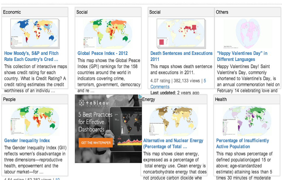
3- Mapstory
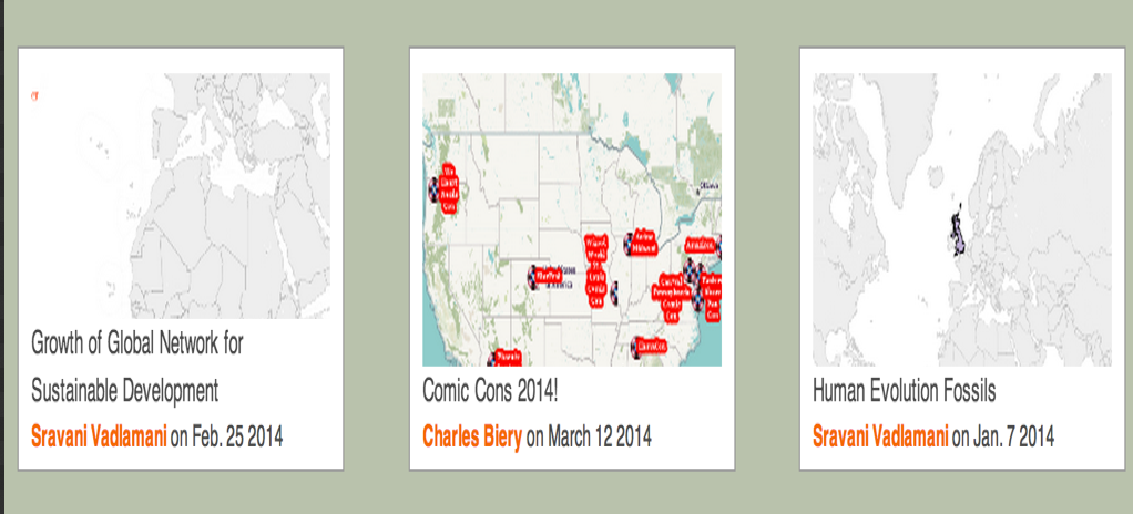
MapStory empowers a global community to organize knowledge about the world spatially and temporally. With MapStory, people of all kinds turn into Storytellers who can create, share, and collaborate on MapStories and ultimately improve our understanding of global dynamics, worldwide, over the course of history.

Creately is another good tool to visually represent your data. Some of its features include :
- 50+ types of diagrams with specialised features to help you draw faster and better.
- Real-Time collaboration and Projects help you work with colleagues where ever you are.
- Thousands of examples and comprehensive shape libraries. Visualize your ideas with amazing ease.
- It is integrated with Google Apps and Chrome
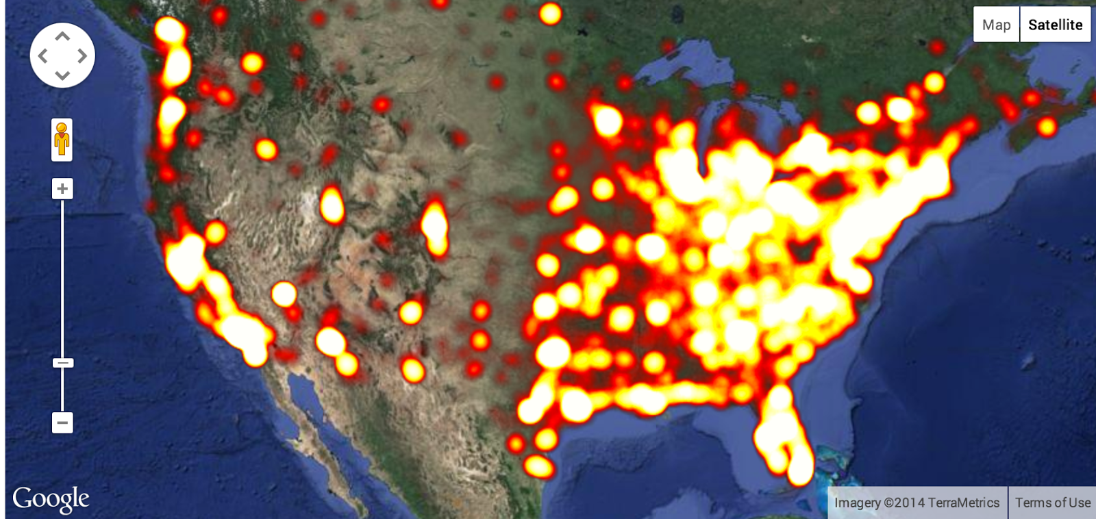
HeatmapTool is a service for creating spectacular and accurate representations of your data. A heat map allows you to quickly visualize spatial data using a range of colors, and when combined with the power of the Google Maps API, visualizing location information has never been easier.
6- GeoCommons
- Easy map visualization
- Animate your data through time and space with our one-click temporal analysis.
- All of your visualizations are easily shareable on Facebook, Twitter, and embedable on your blog.
- You can easily view, edit, and track the usage of your data.
- Investigate data and maps using our easy filters for limiting by any number, string, or date attribute. Don’t stop at one filter analyze all the dimensions of your data. Create new datasets and maps, track versions, and access derivatives.

Gliffy is a web-based tool that allows you to create and visualize your data into flowcharts, org charts, UML diagrams, network diagrams, wireframes, technical drawings and more. Besides being able to embed your diagrams into your website or wiki you can also add Gliffy to your Google Apps account.
8- ChartsBin